[T07] Summarizing data
Module: Basic statistics
- T00. Introduction
- T01. Basic concepts
- T02. The rules of probability
- T03. The game show puzzle
- T04. Expected values
- T05. Probability and utility
- T06. Cooperation
- T07. Summarizing data
- T08. Samples and biases
- T09. Sampling error
- T10. Hypothesis testing
- T11. Correlation
- T12. Simpson's paradox
- T13. The post hoc fallacy
- T14. Controlled trials
- T15. Bayesian confirmation
Quote of the page
If you have knowledge, let others light their candle by it.
- Margaret Fuller
Help us promote
critical thinking!
Popular pages
- What is critical thinking?
- What is logic?
- Hardest logic puzzle ever
- Free miniguide
- What is an argument?
- Knights and knaves puzzles
- Logic puzzles
- What is a good argument?
- Improving critical thinking
- Analogical arguments
§1. Pictures: pros and cons
When data are presented to an audience, whether it is on a news report or in a technical journal report, they are usually presented in the form of a diagram. Sometimes, a diagram is used simply to make the data more eye-catching; a list of numbers just doesn't grab anyone's attention. More often, though, the use of a diagram serves some further purpose. A diagram can be used to summarize large sets of data, or to focus attention on some aspect of the data, or to display a trend in the data over time. A good diagram enables the viewer to grasp in a single glance the relevant features of the data, features that wouldn't be obvious from the raw numbers themselves.
However, the power that diagrams have to give us an instant impression of the data can also be abused. Diagrams can be constructed to give the impression that the data have a feature that they don't really have. In this section, we're going to look at some common ways of pictorially representing (and misrepresenting) data. For each diagram, see if you can tell why it is misleading, and then click on "Answer".
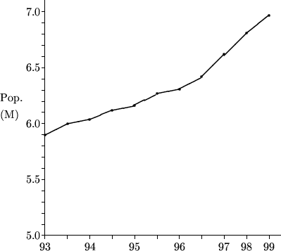
Hong Kong's soaring population?
The first graph shows Hong Kong's population from 1993 to 1999. It has two misleading features, one worse than the other.
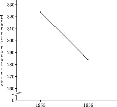
An effective campaign?
In 1956, the U.S. state of Connecticut began a severe crackdown on speeding drivers. The following graph shows the annual number of traffic fatalities before and after the crackdown. In what way could this graph be misleading?
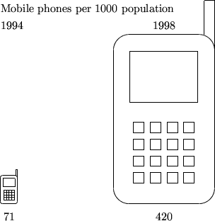
The mobile phone revolution
The following diagram represents the increase in mobile phone ownership in Hong Kong from 1994 to 1998. In what way is it misleading?
§2. Measuring the middle
Data aren't only summarized by means of graphs and diagrams; quite frequently, data are summarized using numbers. The most frequently cited number is the average of the data. For example, the 25 June, 2000 issue of the South China Morning Post (which just happened to be close at hand) cites averages in every section. In news features, researchers interviewing drug users "found that 18 per cent had shared needles or syringes with three other people on average" ("HIV rate among addicts sharing needles soars", p. 3). In business features, Thai officials report that "more than 360,000 tourists came for golf holidays last year, spending an average of 8,000 baht a day, almost twice that of the average visitor" ("Cheap health care may yet provide the biggest tourist lure for Thailand", p. 4). In sports, "ever since making a full debut against Brazil in 1994, as a 21-year-old, Milosevic has averaged something very close to a goal every two games" ("Yugoslav Villan turned hero", p. 14). Even the weather report tells us that "total rainfall since January 1st is 1,334.5 mm. against an average of 926.6 mm." (p. 2).
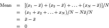
When newspapers talk about the average value of some quantity, they are almost always referring to what statisticians call the mean. The mean of a set of N numbers is the sum of the numbers, divided by N. So, for example, the mean of the data set {2, 5, 5, 8, 10} is (2 + 5 + 5 + 8 + 10) ÷5 = 6. The mean gives an idea of where the "middle" of the data set lies.
However, the mean is not the only way to express the "middle" of a set of data. Another way is to cite the median of the data. The median is quite literally the middle value; list the numbers in the data set in increasing order, and the median is the middle one. So, for example, the median of the data set {2, 5, 5, 8, 10} is 5. If the size of the data set is even, then there are two numbers in the middle, and the median is the mean of these two numbers. So, for example, the median of {2, 5, 5, 8, 10, 12} is (5 + 8)÷2 = 6.5.
The reason that the mean is most often used to typify a data set is that it has a central place in the theoretical machinery of statistics, and is closely connected with concepts such as probability and expected value. For example, suppose you play a game in which you toss a fair coin, and you win $2 if the coin lands heads and lose $1 if the coin lands tails. The probability of each outcome is 0.5, so the expected value of the game is (0.5 x $2) - (0.5 x $1) = $0.5. The concept of expected value is related to that of the mean in that if you play the game over and over again, your mean winnings per game will eventually get closer and closer to the expected value.
Despite these advantages, the mean is not always the best way to summarize a data set. One advantage of the median over the mean is that it is not sensitive to outliers. An outlier is an extreme value which is exceptional in some way, and hence not representative of the quantity you are interested in. As we saw before, the mean of the data set {2, 5, 5, 8, 10} is 6, and the median is 5. If we change the data set to {2, 5, 5, 8, 100}, the mean rises to 24, but the median remains unchanged at 5. In many cases, when the data set contains outliers the median provides a better way of summarizing the data. For example, perhaps the data represent the number of aeroplane flights taken by a sample of Hong Kong residents in the past year, and the figure of 100 comes from a professional pilot; in this case, the median of 5 flights per year is probably more representative of the population at large than the mean of 24 flights per year. More examples can be found in the following self-test questions.
The following table shows the starting salaries of the students graduating from a particular degree program at a Hong Kong university (the figures are invented):
| Student number | Salary (HK$/month) |
| 00001 | 14,000 |
| 00002 | 14,500 |
| 00003 | 14,000 |
| 00004 | 16,000 |
| 00005 | 19,000 |
| 00006 | 12,000 |
| 00007 | 15,500 |
| 00008 | 86,500 |
| 00009 | 16,500 |
| 00010 | 13,000 |
Calculate the mean and median values for this data. Why are they so different? Which is likely to be the best way to summarize the data?
The following table shows students' marks for a particular coursework assignment (the figures are invented):
| Student number | Mark |
| 00001 | 59 |
| 00002 | 61 |
| 00003 | 57 |
| 00004 | 0 |
| 00005 | 51 |
| 00006 | 64 |
| 00007 | 70 |
| 00008 | 0 |
| 00009 | 55 |
| 00010 | 0 |
Calculate the mean and median values for this data. Why are they so different? Suppose there is a policy that the mean mark for each assignment must be close to 58; if the mean is more than 5 points below 58, a fixed quantity is added to each student's mark so that the mean becomes 58. What does the policy require in this case? Does it seem like the right response in this instance?
§3. Measuring the spread
Although the average is the most frequently used statistic for summarizing a set of data, it is often quite uninformative without some idea of how widely spread the data is--whether all the data points are clustered tightly around the average, or whether they range widely from the average. Two ways of expressing data spread are the standard deviation and the interquartile range; the first is based on the mean, and the second is based on the median.
The standard deviation is obtained, roughly speaking, by finding the average distance of the data points from the mean. But this has to be done in a particular way. The most obvious way of finding this average is to subtract the mean from each of the N data points, add the resulting numbers and divide by N. But this won't work. Why not?
So instead, the standard deviation is calculated using the following recipe:
- For each of your N data points, calculate the square of the distance between the data point and the mean.
- Add these numbers together.
- Divide the result by N-1.
- Take the square root.
This recipe is rather involved; fortunately, most calculators can compute a standard deviation for you.
Despite the complications of calculating it, the standard deviation is the most commonly cited measure of spread. This is because it is used in many statistical techniques, and it has useful connections to some common ways in which data points are distributed. For example, in many real-life situations, the distribution of data points follows what is known as the normal distribution (or bell curve). For data distributed in this way, it can be shown that two-thirds of the data lie within one standard deviation of the mean, 95% of the data lie within two standard deviations of the mean, and 99.7% of the data lie within three standard deviations of the mean. The number of standard deviations from the mean for a particular result can be used as a measure of how unusual that result is; it is not terribly unusual to get a result over one standard deviation from the mean, but it is quite unusual to get a result over two standard deviations from the mean, and very unusual to get a result over three standard deviations from the mean. We will come back to this topic later.
The interquartile ranged is based on the median of a data set. Remember that the median m divides the data set in two; half the data points are below it and half the data points are above it. Now take the points below m (including m, if it is a data point) and find their median. Call this the first quartile. Then take the points above m (including m, if it is a data point) and find their median. Call this the third quartile. The second quartile is m itself. What we have done is to divide the data into four equal parts; a quarter of the data points are below the first quartile, a quarter are between the first and second quartiles, a quarter are between the second and third, and a quarter are above the third quartile. The interquartile range, as its name implies, is the distance between the first and third quartiles.
The advantage of the interquartile range is that it is easy to calculate and easy to visualize; exactly half the data points fall within the range. However, it does not have the nice connections to other statistical techniques that the standard deviation has.
For large data sets, finer-grained distinctions into percentiles are sometimes used. Percentiles are like quartiles, but they divide the data set into 100 equal parts. For example, the 34th percentile of a data set is the value such that 34% of the data points are below it and 66% are above it. The 50th percentile is the median.
The following table shows (approximate) monthly market turnover for the Hong Kong Stock Exchange for 1999. (Source: Hong Kong Securities and Futures Commission).
| Month | Turnover (billion shares) |
| January | 50 |
| February | 35 |
| March | 75 |
| April | 100 |
| May | 130 |
| June | 120 |
| July | 135 |
| August | 85 |
| September | 215 |
| October | 125 |
| November | 145 |
| December | 190 |
Calculate the mean and the standard deviation. Find the median and the interquartile range. How many standard deviations below the mean is the February figure? How many standard deviations above the mean is the September figure?
§4. The importance of spread
In many contexts, the mean or median of a set of data is quoted without any indication of the spread of the data. Sometimes this is not a problem; for example, the fact that Yugoslav soccer player Savo Milosevic has scored an average of one goal every two games since 1994 is enough to tell you that he is an impressive striker. However, in other situations, knowledge of the spread is important.
In the following examples, see if you can spot the flaw in the reasoning, which in each case concerns overlooking the spread of some quantity.
- The average June temperatures in Hong Kong and Tucson, Arizona are both about 28°C. So you can expect similar temperatures in Hong Kong and Tucson in June.
- The average household size is 3.6 people. So new housing should be built to accommodate 3 to 4 person households.
- The mean weight of one-year-old boys is 22.5 pounds. So parents of a one-year-old boy weighing 20 pounds should be concerned about their child's development.
- Two students take an IQ test. Student 1 scores 98, and student 2 scores 101. Since the mean IQ score is defined to be 100, student 1 is of below average intelligence, and student 2 is above average.